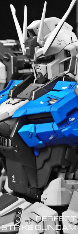
OK. This ain't finished. That's the bottom line. I still have tons of decals to add and I have not even finish the BFG and base. But nevertheless, I will post some pictures of it since Mr Donc has already done up his. THe purpose of this build is to give the O an overhaul. I guess by now you guys have seen enough of those monstrous versions. So I have decided on the onset to do a "slim" version of the O. Of course there are not a single reference I can find out there. I tried several designs but could not find a suitable frame for it.
And it so happened that I was fiddling with a PG Strike that I realized that its frame suits my idea perfectly! Well, by then it's already mid September and I have not enough time to work on something so massive.
Well of course, this build was done in as a FACE-OFF with DC23. He has done a really impressive interpretation of the O complete with a nice diorama. Without further delay, I present to you my unfinished Master The O. Please forgive me for not completing this in time. I will finish a maintenance structure and post more WIPs soon.


25 comments :
Sexy! awesome work sir! XD..
awesome work of art bro.
It's simply perfect!!!! The modding is awesome and the idea to change the lesgs and foots is ingenius!!!! excellent work as usual Kenny.
very nice...!! great details.. great work bro..its huge!!!
very nice!!! love the details and paints!! great work bro... its huge!!
So the PG strike parts fits well with the-O... That IS unexpected.
I'm wayyyyyyyyyyyyyyyyyyyyyyy beyond your league bro...
Awesome level: IT's OVER 9000!!!!
Exceptional work! Awesome! Cant wait to actually see it!
Super Awesome!! The O has slimmed down and became a templar warrior! And the color scheme fits perfectly, broke your creative barrier again heh
Nice work! I prefer your design over DC23's design (His design is still awesome). Just a comment, maybe you shouldn't add too much decals since the design carries a medieval feel but that is just me.
I know you hang out at HAG or HAW, I have visited HAG and HAW several times but don't know who you are in person. By the way, any chance your The O will be sold through Poison Monkeys?
Amazing work sir... I love it so much!..=) If its ok I'll borrow some ideas because I'm inspired very much...=)
Amazing work as always! Top notch design, and flawless execution! It has a slight "five star stories" feel to it. Love it!
this is superb build and design, i like it. please allow me to give some comments on this build, i think this time u are super rush on this kit, can see it from the panel line works, and also still can find some molding line, especially on the 2 sticks on the torso part.i like the color combination on the top part, especially on how u play with 2 tones of yellow combined with the dark gray/black color, but somehow i found the lower part a bit too plain which only dominant by the yellow color, i think adding more gray/black tone will balance the top and the bottom part on the overall kit.but again, as u said, this is not yet finished.. i believe you will come out with amazing surprise. keep it up man, i am really enjoying your work. cheers
This is the sexiest The O, that I have ever seen! Great job! My vote goes to this.
Thanks for your kind comments, guys.
@ Frost, I am trying to complete this with a base. Whether this will be sold.... Well I really don't know man...
@ Anonymous,thanks for your valuable comments. The pistons were not painted at all and i need to sand down the mold lines and repaint them. Once again, thanks for writing your views. Appreciate it.
both work are amazing..is the build-off going to be like, one will win the other will lose?cause i think both are just amazing works..both are winners to me..:D
amazing, amazing work from two master modelers..very inspiring work..:)
Quote "God is in the little details"
Beautiful work
Amazing work and precise SB
What I liked is that you made the original heavy model to be lighter and less heavy in overall appearance
The color I think should be different - run moor from the yellow
Work on the "hip" "skirt" very much changed the model look , and contribute to the ligh look
The best thing that I like in your work is that every time I discover a new detail I had not seen and ....
And I enjoy again and again and again and again and again and again and again and again ...........
bro, that is totally wicked mods already..Great job on ''THE O''
Although I like the overall look of the build, I can't say that I like the front skirt part. The verticality and the thinness gets a nimble 'fractured' look due to the proportion of the break-line distance with the overall length of the skirt.
In my opinion if you had more horizontal line work, just enough to create more details there, the front skirt would look more bad-ass.
Thanks
Hi there! It would be nice if I can address you by name bro! Thanks for your constructive comments and you are right that the front skirts can be improved. So... Who want to commission me to do an updated version of Odin? lol....
Once again, thanks for your comments :-)
Citrus has left a new comment on your post "The O":
I love the orange colour that you used! It's a lot more attractive than the sort of yellow most others have been using for this kit. It looks great! Using a skinnier frame underneath to slim down the MS is a clever idea, too, but it makes this whole model looks less like The-O and more like a PG Strike dressed as The-O. I think if you fabricated some parts for the legs and arms that looked more like the curves of the original design, it'd definitely make the model a lot more like The-O, rather than just a Strike wearing an apron.
Hi Citrus, thanks for your suggestions. I accidentally deleted your comments before I could publish it. But I managed to retrieved it after some searching.
I have considered fabricating curved parts for the legs and the arms but my intention was to make it less curvy and more boxy. What I should have do is to redesign the PG Strike armour to my own interpretation rather than leaving it as it is. But I leave that for another day.
And I was literally laughing my head off when you mentioned this is a Strike Gundam wearing an apron. OK then, I renamed it as Strike-O lol...
Thanks!
Ah! I can kind of see what you mean! The skirt pieces are a lot more rectangular than the original, and I certainly do prefer your look over the original curves. If you do plan on adding boxier custom armour to the Strike frame, I'll really look forward to it! This is a really fantastic piece all the same.
Maybe I will attempt one in the future. Right now, I am exploring other options as well. I think the Sazabi will be a perfect fit for the Strike frame :) But to attempt something so massive all over again...zzz...zzz...
Hey toymaker, can you take a picture of odin and the "out of the box" the o gundam? I just want to see the height difference... Thanks!
Hi, I will try to get another O since I do not have a OOB one with me at the moment.
Thanks.
Post a Comment